Client: Milken Institute
Role: Lead Designer, Frontend Development
Duration: 6 months
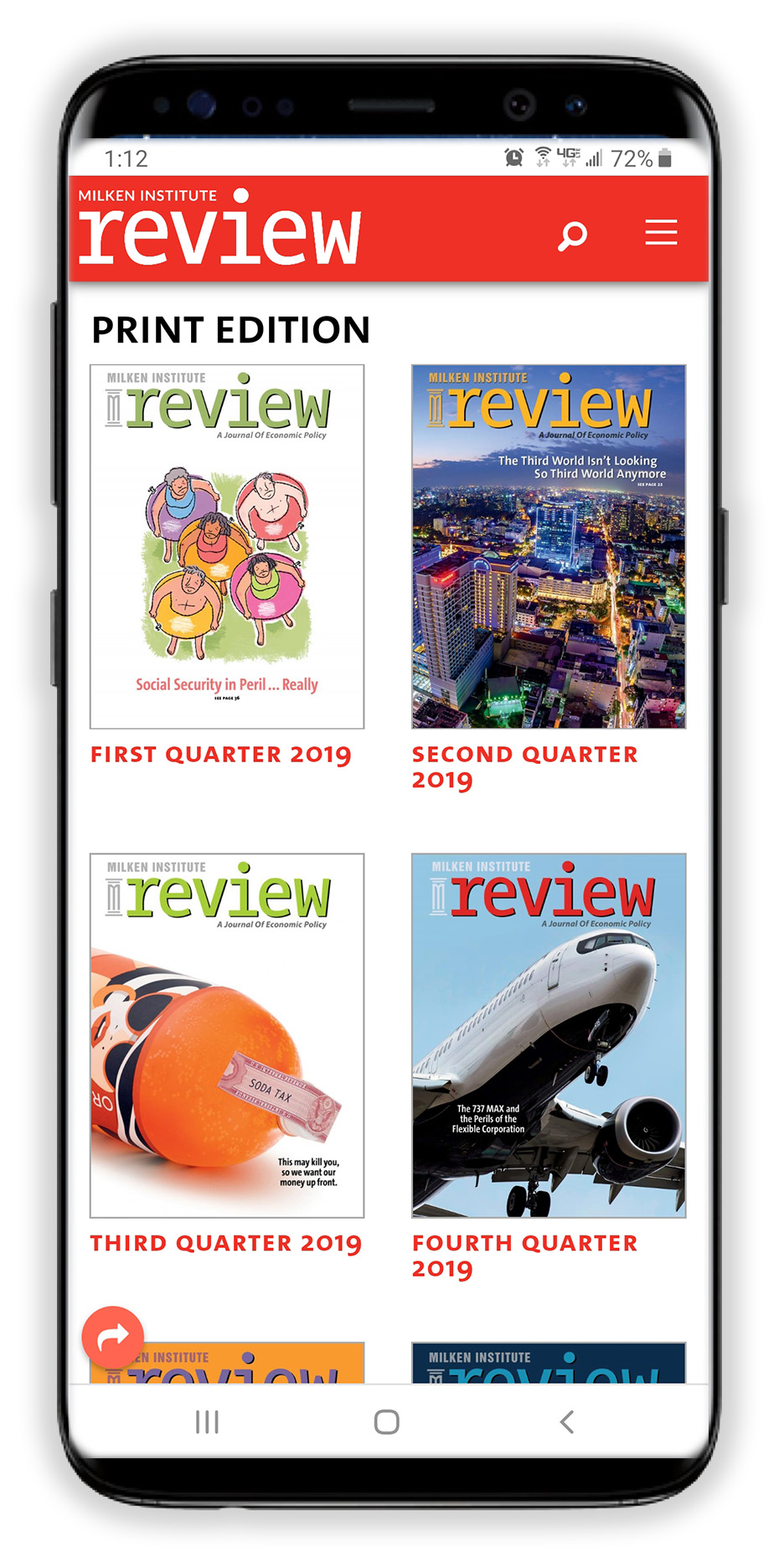
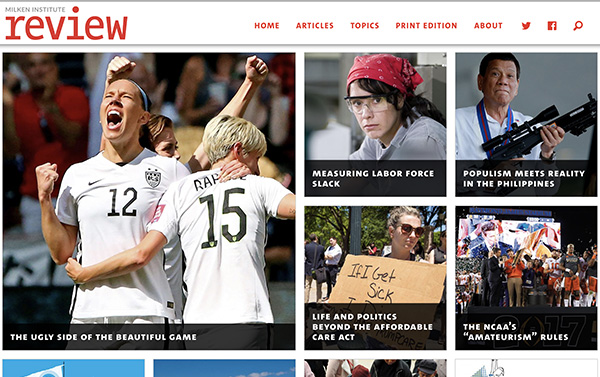
There had never been an online presence for the Milken Review, so there was no established framework for a site. The audience is well-read, older, and operates in financial and economic circles.
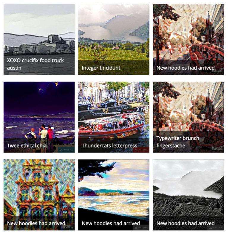
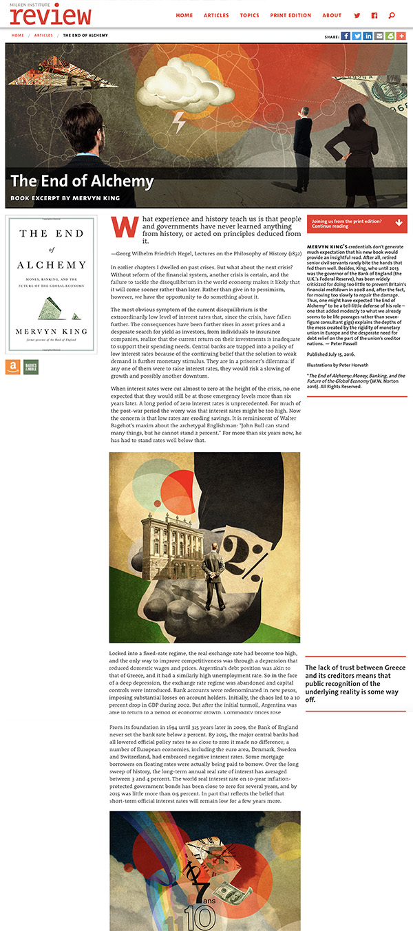
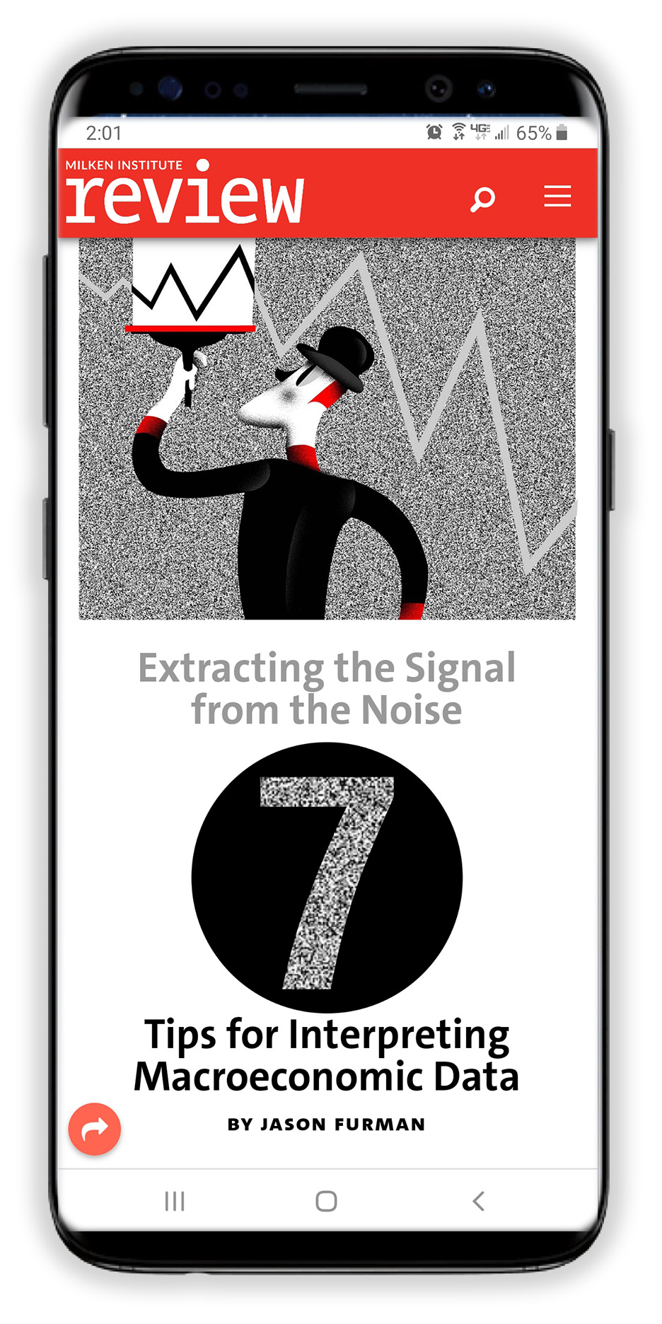
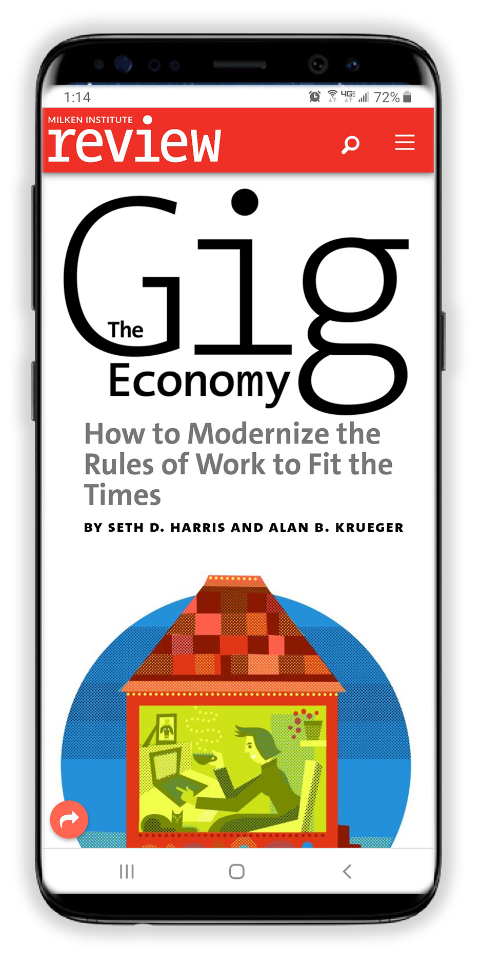
The overall design was to be simple so that the focus would be placed on the articles, as well as amazing professional photography and illustrations.
Also, branding contained only one color, which was to be used across all aspects of the design. This meant the site would use only tonal values of the color to express everything from navigational menus to links to buttons to backgrounds.
In addition, the site was to be completely designed and all development done in a "mobile-first" framework, and "shorthand" CSS codes added for non-technical editors to customize content.
Hover State (Buttons, Links, CTAs)
Header, Footer, Iconography, Top and Bottom Image Borders, Separators
Body Text, Headings
Separators, Horizontal Rules
Page, Body
font-family: 'Crimson Text', sans-serif;
Bold, Italic
This is a paragraph. Lorem ipsum dolor sit amet, consectetur adipiscing elit, sed do eiusmod tempor incididunt ut labore et dolore magna aliqua. Ut enim ad minim veniam, quis nostrud exercitation ullamco laboris nisi ut aliquip ex ea commodo consequat.
font-family: 'Hind Siliguri', sans-serif;
Bold, Italic
This is a paragraph. Lorem ipsum dolor sit amet, consectetur adipiscing elit, sed do eiusmod tempor incididunt ut labore et dolore magna aliqua. Ut enim ad minim veniam, quis nostrud exercitation ullamco laboris nisi ut aliquip ex ea commodo consequat.

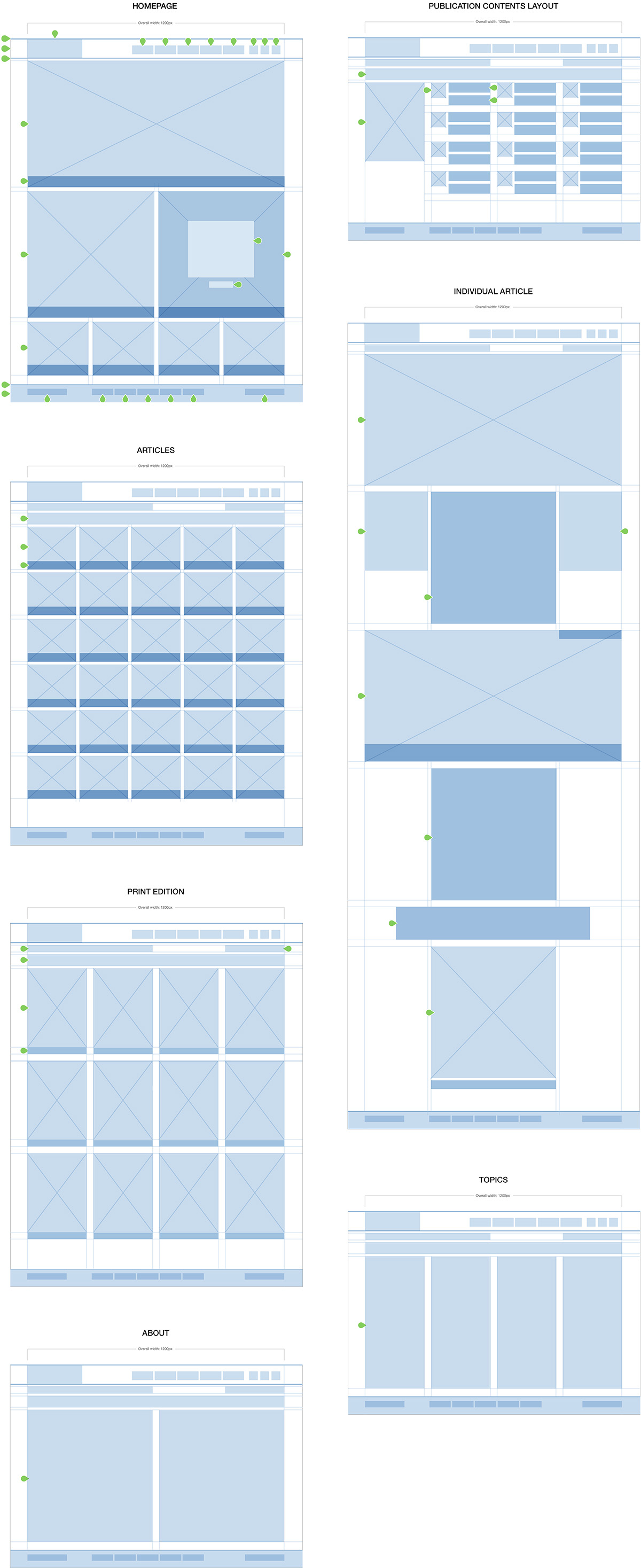
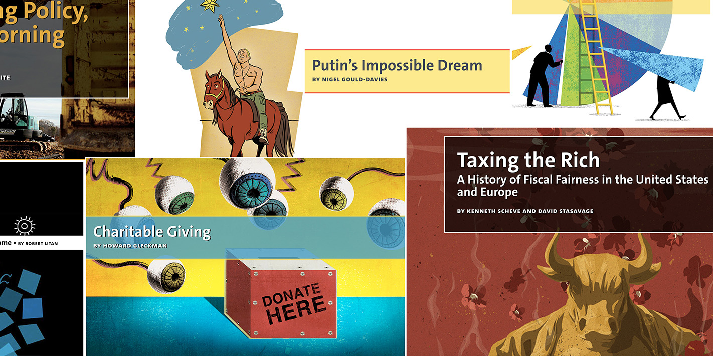
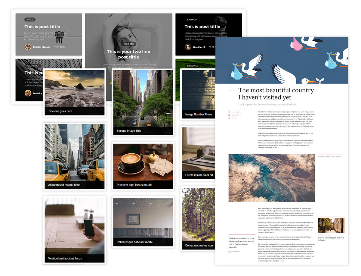
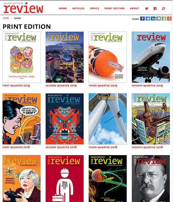
The Masonry site widget was incorporated into the Zurb Foundation framework used with the Silverstipe CMS. This enabled the content blocks on the homepage to fill into the space, regardless of how large the blocks were set.
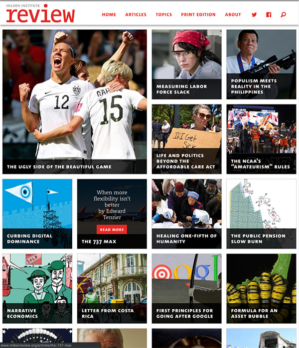
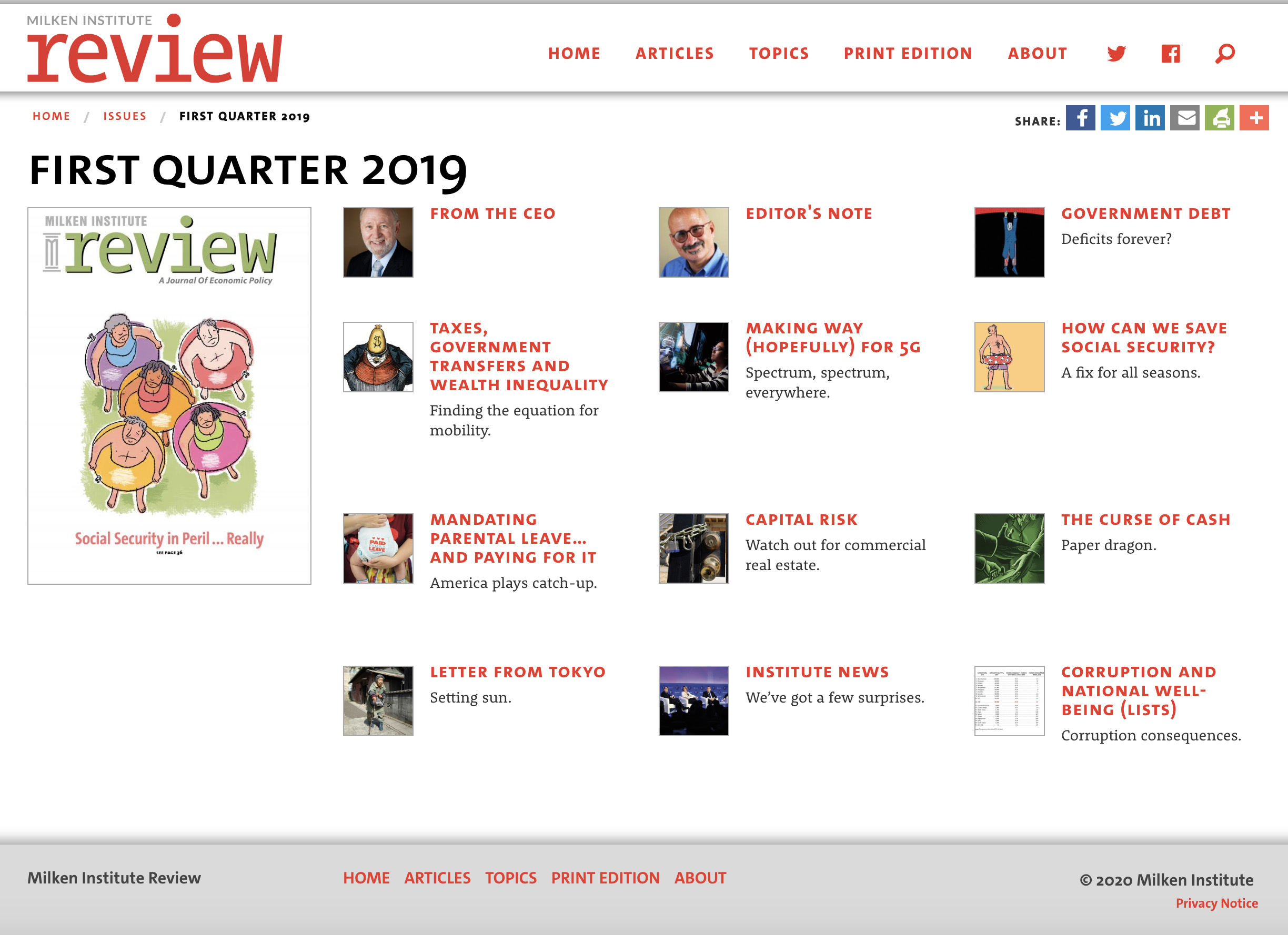
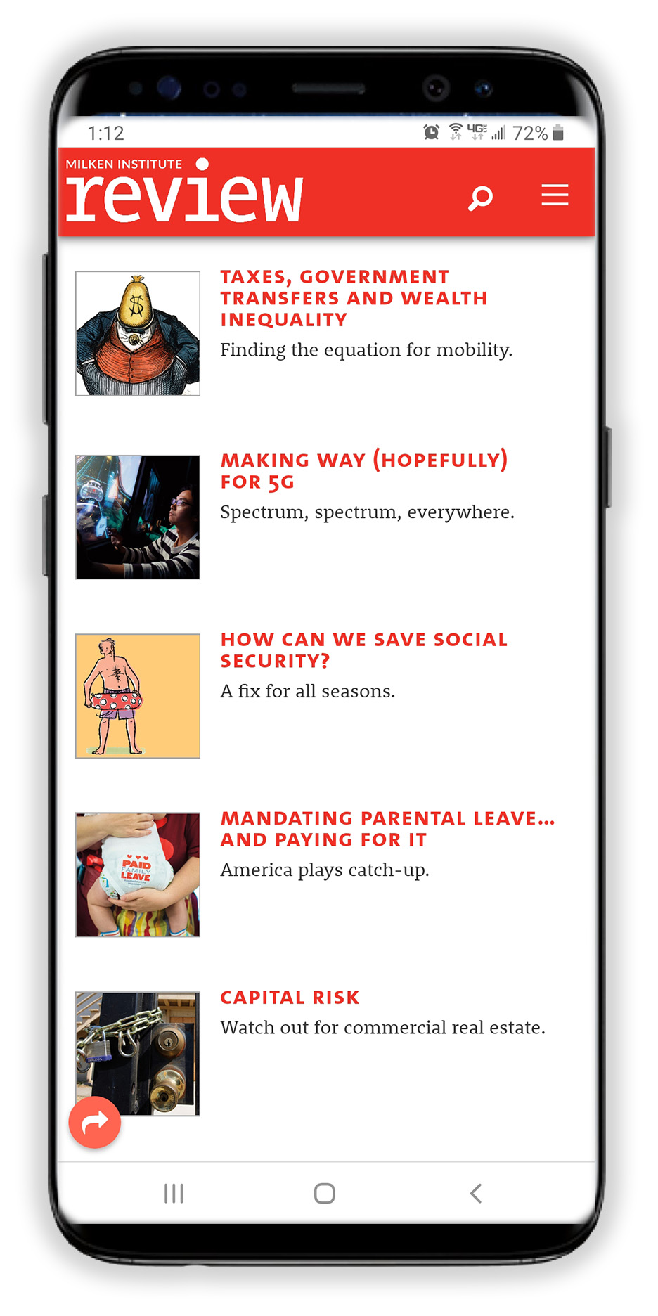
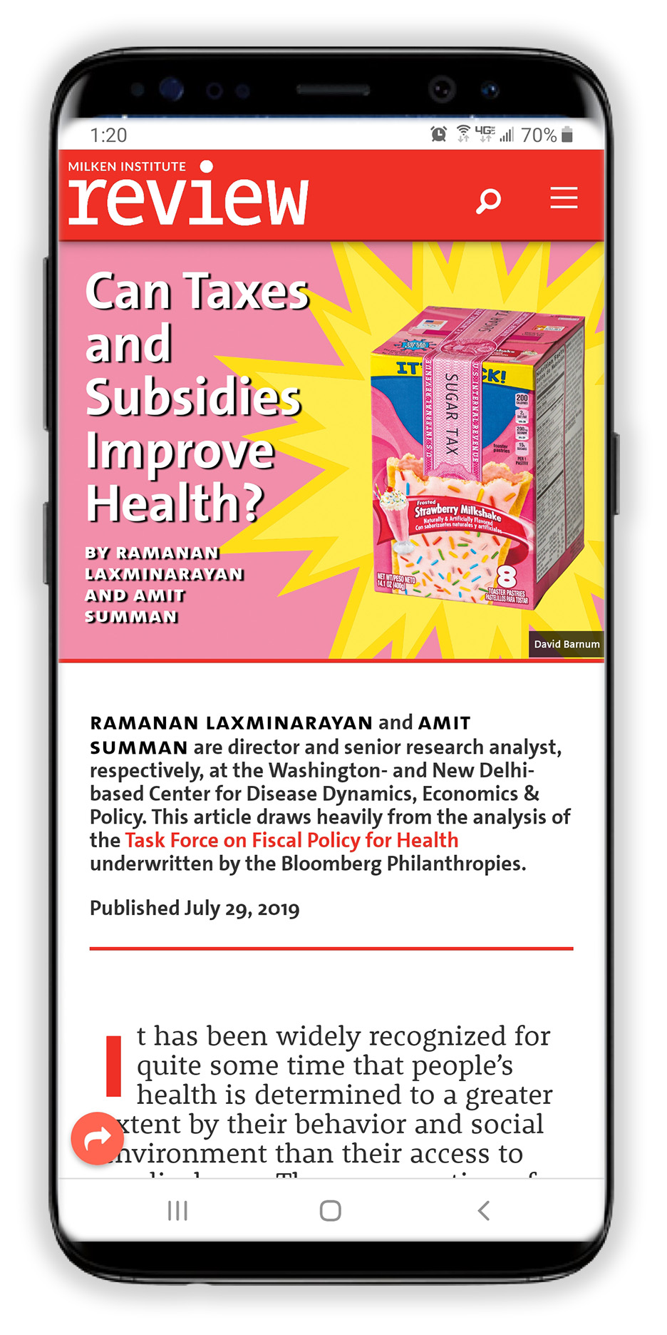
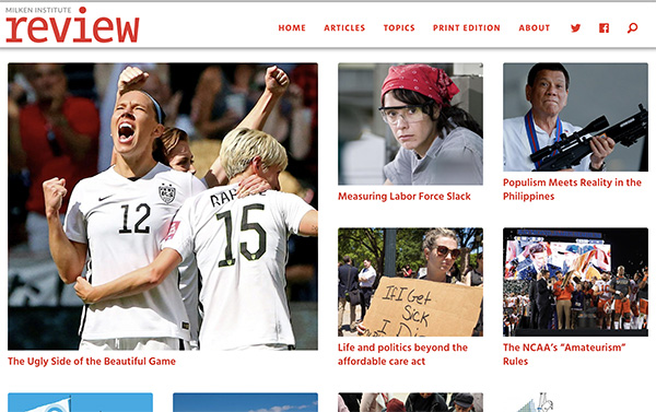
As the client was busily entering in the content from recent publications to fill the queue, it was discovered they were not in the practice of linking content as a visual queue to inform the user as an "intent to click".
Having studied "Designing for the Scent of Information" by Jared Spool some time ago, It was proposed that links should be formed around phrases rather than just keywords, which would prevent the user from having to read all the content around the link in order to determine what they were about to click on, and would information them about the content that would be behind the link.
Links were set in the CSS to a bold font weight for more visual emphasis.
The result is a strong visual queue to the reader that a link exists, and what the link reference is about. Ultimately it promoted a better click-through rate.
Examples as follows:
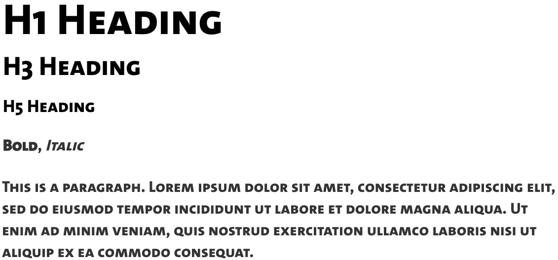
The site was a great success, and the client was extremely happy, but in hindsight there are minor drawbacks. Specifically, tight content blocks, the all-caps "Sans 800 SC" font (from the original magazine) used in all the headlines, and reverse type combined to make it harder to quickly scan the titles of the homepage, Articles, etc. when viewing on a desktop.
Some refinements would make it easier to scan headlines, and open up the page(s).
Below is a quick "before and after" revision to the code through the Inspect function of Chrome to demonstrate:
Aside from a few shortcomings, it was a great success... We look forward to the opportunity to work on a redesign/refresh in the future.